One of the things I love about Little Greene Paint (apart from its amazing quality and colour range!) is the fact they offer colour scales in some of their most popular shades.
According to Little Greene themselves...
"Colour Scales is a collection of 48 neutrals in 12 families.
Each family is made up of four shades, with colours stepped in strength to achieve a more precise shade or a simple, harmonious colour combination when used together."
This is so useful when you are trying to match shades within a room as you know that all colours within the scale will work beautifully together. For example, kitchen cupboards can be painted in a darker shade, walls slightly lighter and skirkings in the palest of shades. No awful moment of finishing the project to realise that actually, the colours really don't in fact work very well together. We have all been there!
I thought I would share with you some of my favourite scales, starting with French Grey.
I adore this fabulous grey and have used varing shades of it in my home. Depending on a rooms light, it can vary from a very true grey, to a slightly warmer putty. It rarely looks cold however which is tricky to find with grey paint.
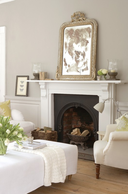
Picture - Little Greene
The walls here are painted in French Grey Dark, 163, the panelling is French Grey, 113 with the fire surround in French Grey Pale 161.
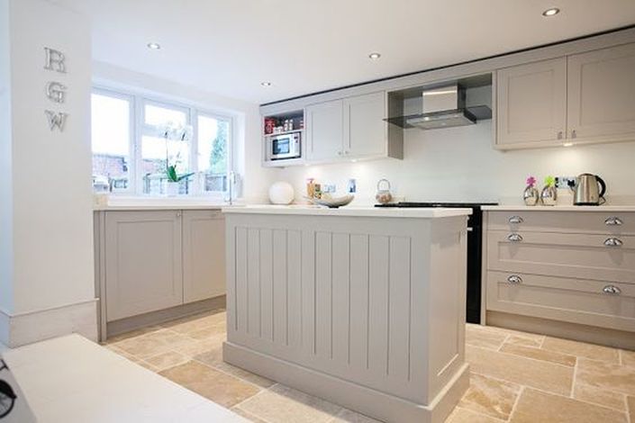
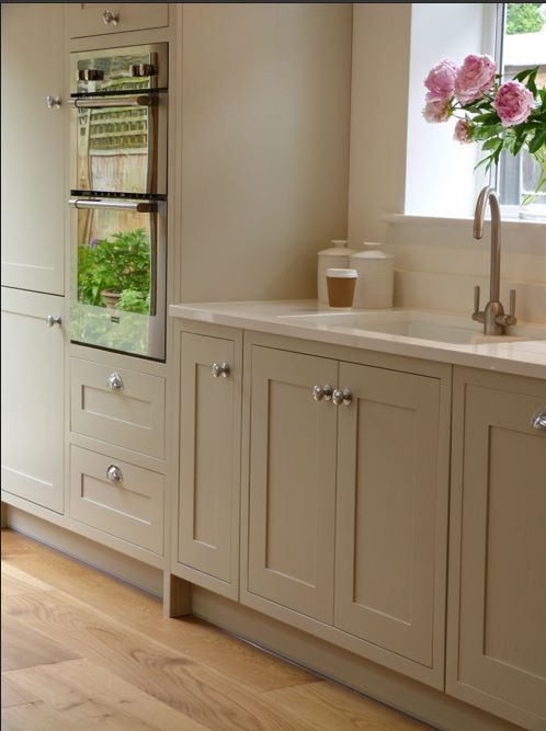
This beautifully light kitchen benefits from French Grey cupboards and French Grey Pale walls.
Picture - Pinterest
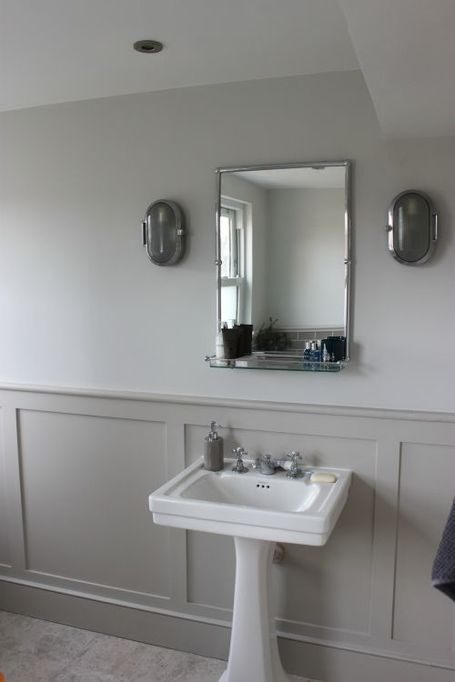
The classic panelling in this bathroom have been painted in French Grey Mid, with the walls in French Grey Pale.
Picture - Pinterest
Moving on to another of my favourite scales, we have Slaked Lime.
A warm and soft neutral this scale works well with so many contrasting shades.
The above kitchen uses Slaked Lime Dark 151 on the cupboards with Slaked Lime Deep 150 on the walls.
A warm and soft neutral this scale works well with so many contrasting shades.
The above kitchen uses Slaked Lime Dark 151 on the cupboards with Slaked Lime Deep 150 on the walls.
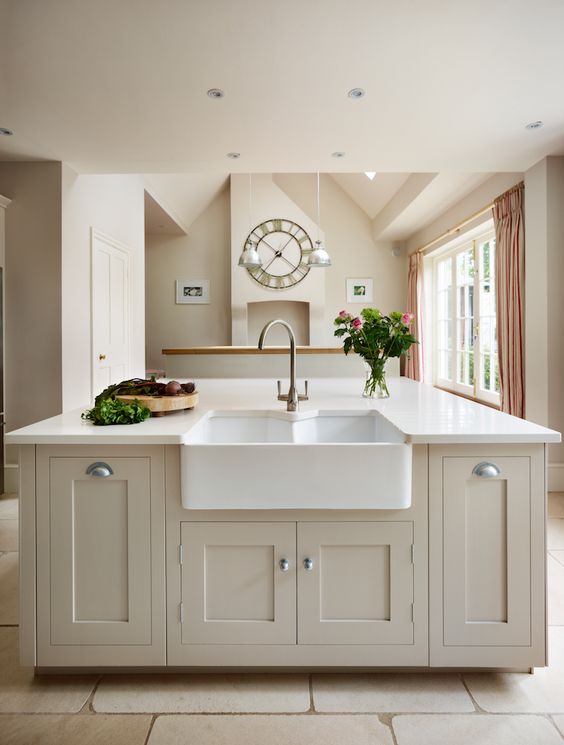
Picture - Pinterest
Lastly, this stunning bathroom has been created using the Rolling Rog colour scales. A gorgeous putty colour this will add real warmth to any room and as you can see looks especially striking when paired with fresh white.
Bath and walls painted in Rolling Fog 143, panelling in Rolling Fog Mid 159.
Bath and walls painted in Rolling Fog 143, panelling in Rolling Fog Mid 159.
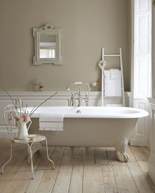
Picture - Little Greene
Enjoy,
Sam
x
Sam
x